Packaging Design and a New Look for Apteekkarin
Background
Oriola wanted to renew and modernize its Apteekkarin brand products sold in pharmacies. A visual packaging redesign was needed that would stand out on pharmacy shelves while also appearing sufficiently trustworthy and "pharmacy-like," so that pharmacists would want to highlight the products and consumers would choose them.
What we did
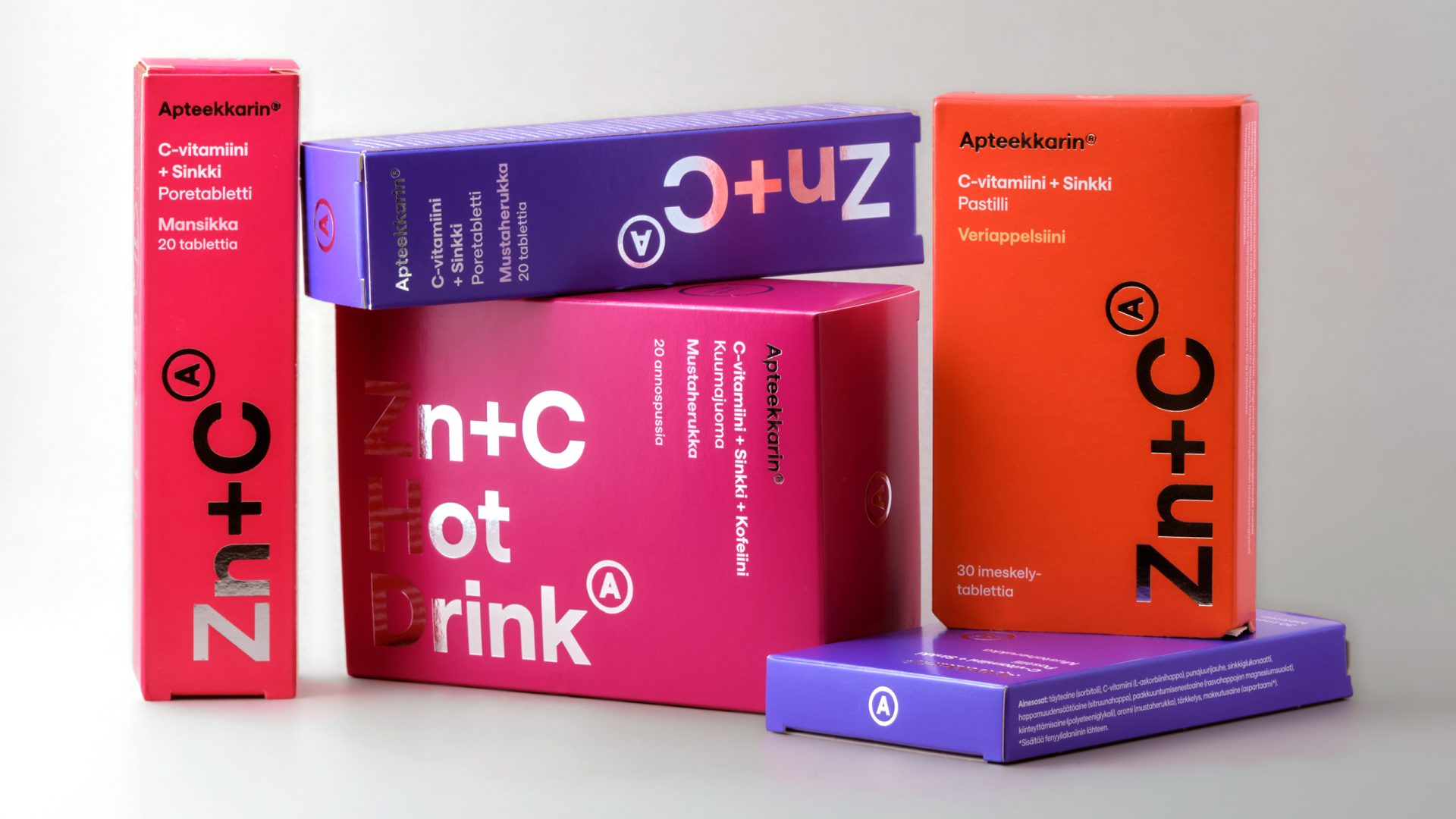
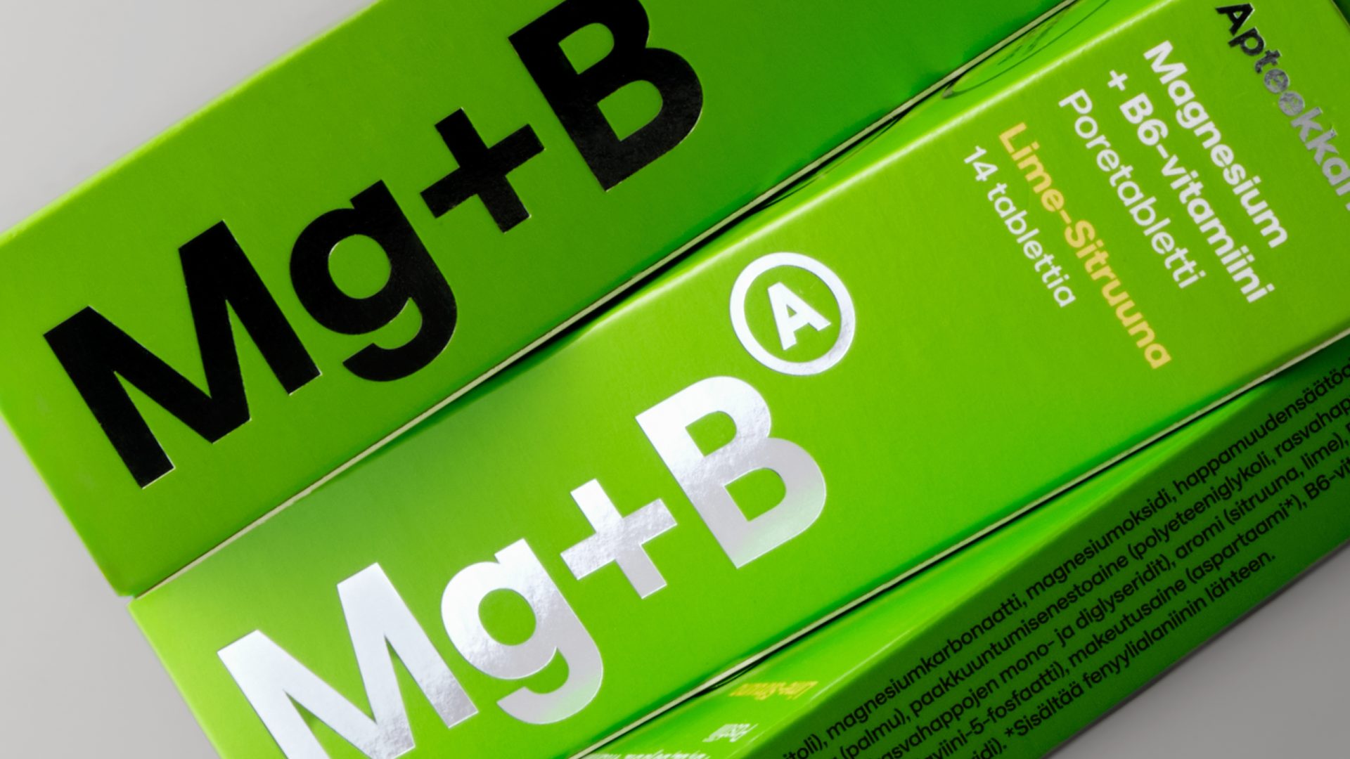
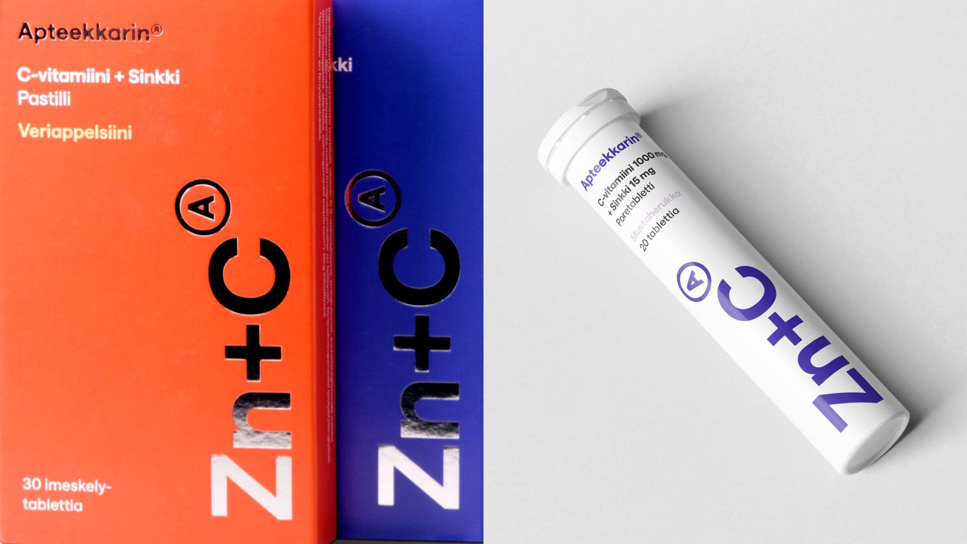
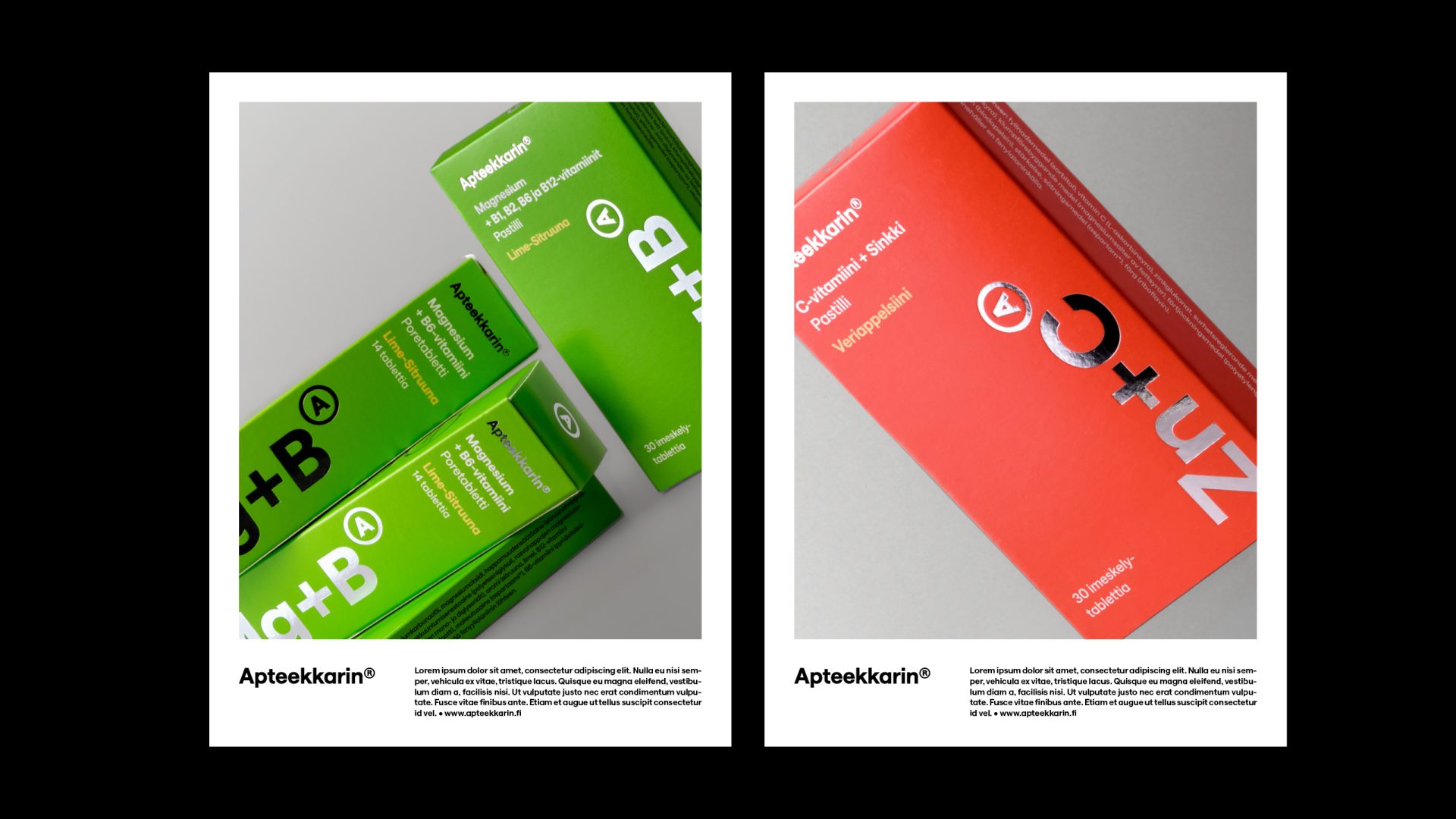
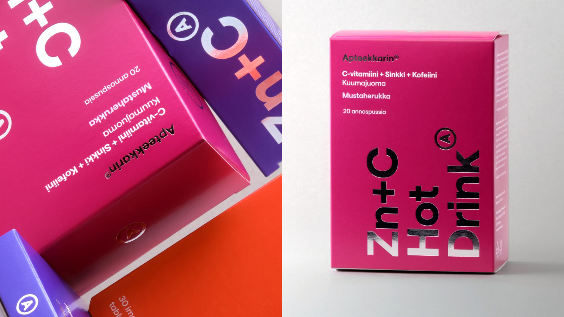
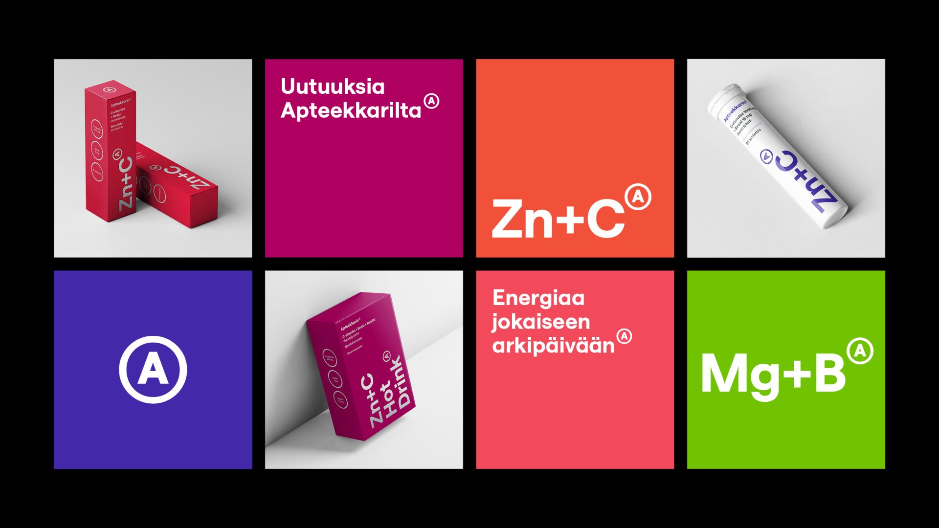
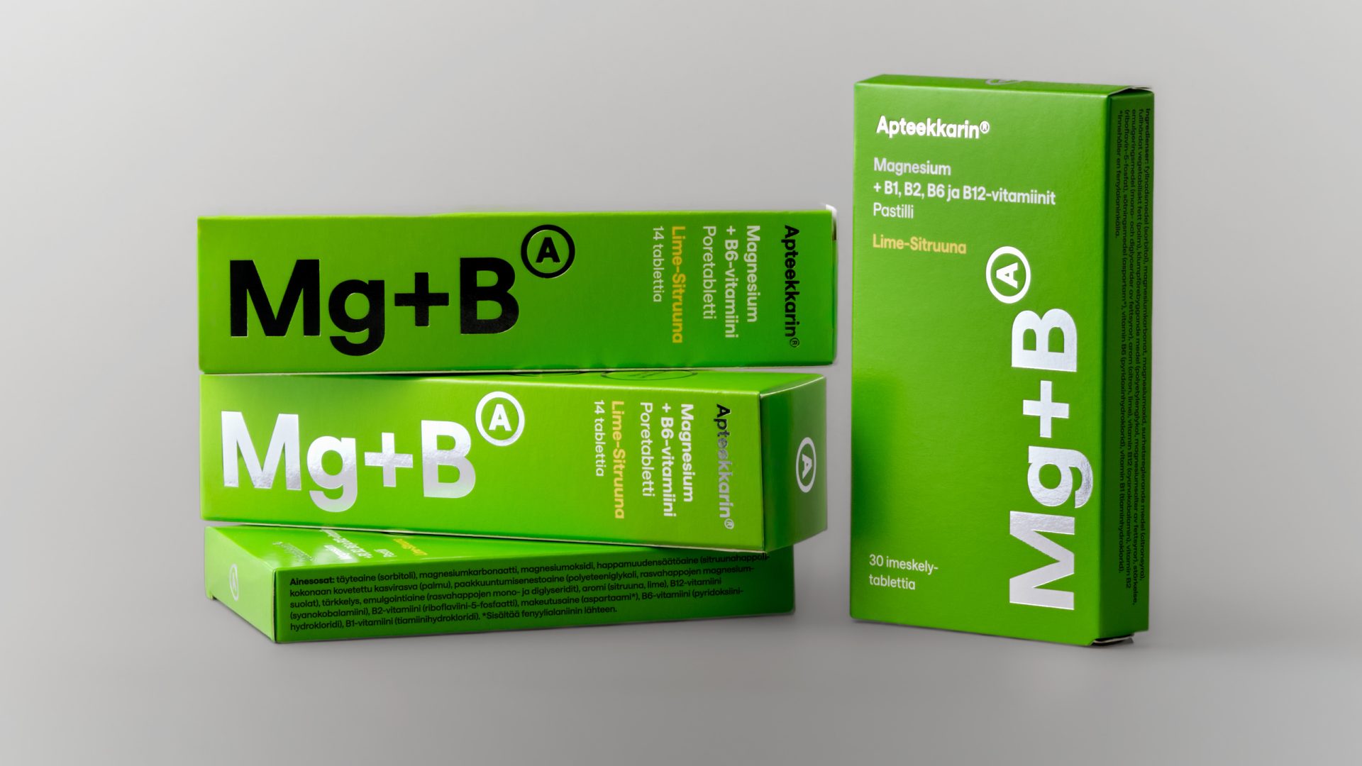
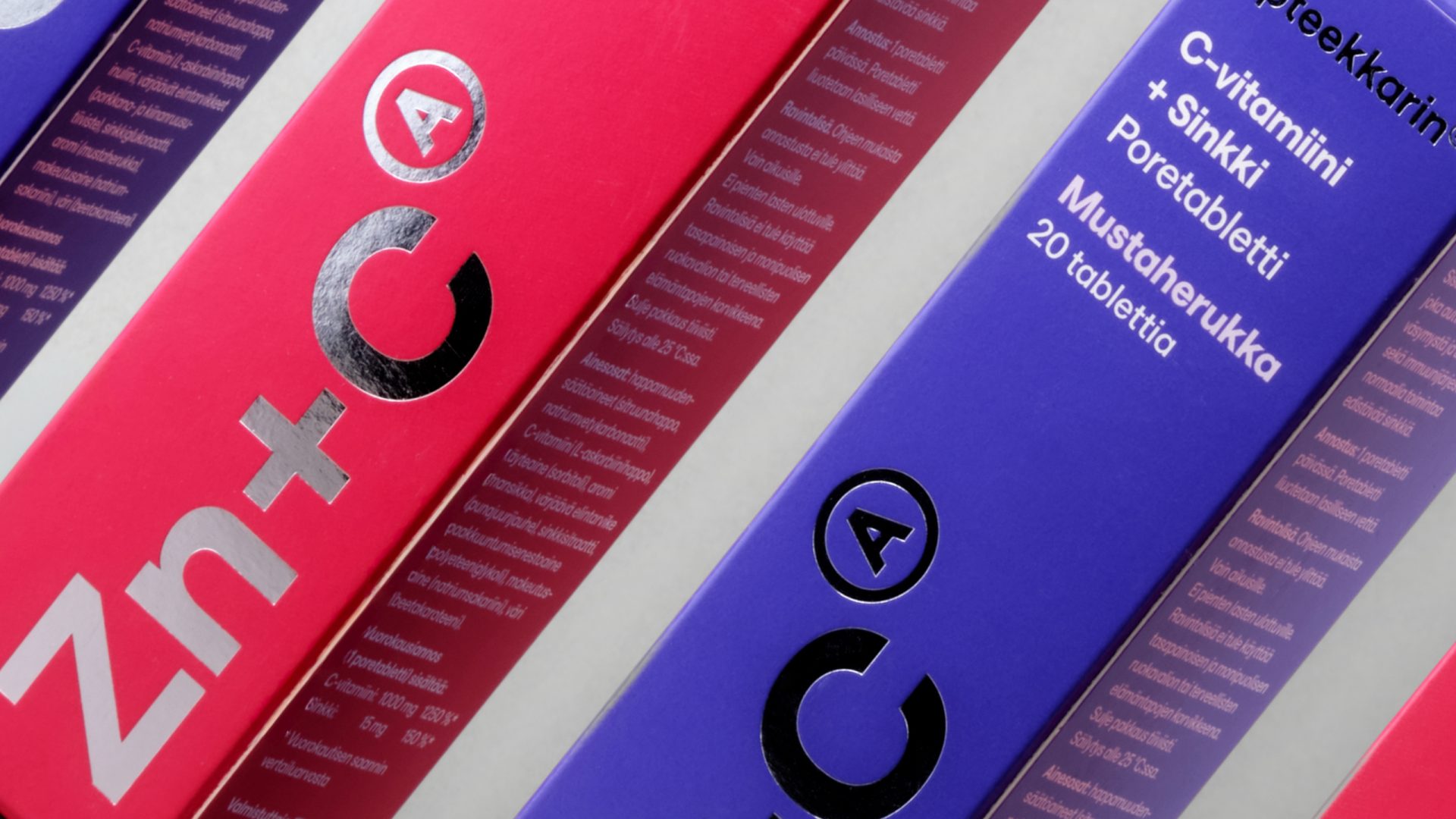
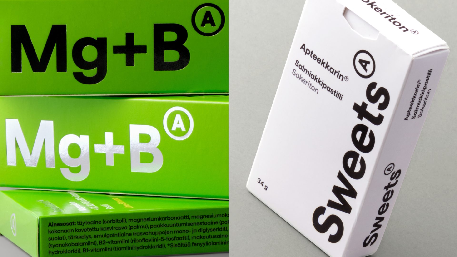
We created a streamlined, vibrant and modern look for the products and redesigned the packaging for more than 20 items. The rich colors of the packaging communicate the flavors of the products and distinguish them from competitors on a unified shelf. Key product features, such as vitamin content, were highlighted with silver foil detailing that conveys quality. The visual redesign was compiled into a clear brand book, making it easy to design packaging for future products.
Insight
Strong color also communicates flavor. We all know the color of blackcurrant, strawberry or lime – color leads into the world of taste without showing images of the raw ingredients.